The following day I began to work on the base of the tree. I continued using the same pattern technique down to the base of the column. I felt the bottom of the pillars could do with more detail so I surrounded the base with some grass. In the grass I drew some apples, this was not in my planning but I felt the base needed something extra. Due to other commitments I didn't manage to get a lot completed on this day.
Wednesday, 29 October 2014

People and Characters/ Drawing on the walls. Update 1
It was now time to begin drawing my illustrations on the wall. I began by drawing a very fine pencil line up the column. This was a guide line for when I would actually be drawing the tree. When I drew the pencil outline I left out gaps in the tree, this is where I would draw in the faces. The tree was drawn using a large permanent black marker. I couldn't draw the base of the tree at this point because another member of my group was working on the same wall at the time. I tried to keep the tree in the same style of my original pen drawings from my old sketchbook. All of the details on the wood were drawn freehand but I think they turned out well. When the tree began to take shape I began to add detail to the faces. There was ample room for four faces in the tree. I wanted them to match the style of the tree but have their own individual character. I managed to complete three which worked with the overall design but because of the limited time frame I don't think they are as good as they could have been. The photos below show my progress so far.


Tuesday, 28 October 2014
People and Characters/ Drawing people session 4. Rebecca
Yesterday we had a drawing workshop, which was a sort of warm up session, before we began drawing on the actual columns. The lady we drew was called Rebecca and she wore a very interesting outfit. It was a rainbow themed costume that was really interesting to draw. I only wish that I had my colour pencils with me at the time because there was a lot of colour in the costume. one of the drawings I added colour afterwords using sharpies because I thought it was lacking. Overall I enjoyed the lesson and completed some interesting drawings.
 | ||
| This was the drawing where I added colour |
 |
| This was a pencil drawing which took around 10 minutes to complete |
 |
| For this drawing I could only use one line |
People and Characters/ Designs for collaborative project
It was decided by my group that I would work on one of the trees. We decided that the two columns should each represent good and evil and have fitting characters placed on them. Two of us in my group were given the evil tree to work on. I had some old designs in one of my sketch books which I thought would work well with the theme. They were both stylised drawings of trees done in pen. I let the rest of the group see them and asked for there opinions. They all liked them and wanted me to do my actual drawing in this style but with faces in the wood. Below are some of the drawings which I would like to base the tree on. They are in a sketch book so please excuse the non related drawings.


Monday, 27 October 2014
People and Characters. Lino cuts of people
For our collaborative project we wanted to use lino cuts somewhere in our instillation. Another member of the team was working on the lino prints but I decided I would like to help out. I wanted to try more lino cutting as I felt I needed more practice and this was a good opportunity. I made two prints from the same block of lino, they are both small but I think the size works. I made a bearded man and a women wearing a scarf. I'm fairly happy with them but I don't know what the final prints will look like. Below are images of the two lino cuts.

People and Characters/ Artist research. Thomas Shahan
I wanted to look at another Print Maker for my artist research.
He is called Thomas Shahan and he does a mix of insect photography and illustration.
I really like his illustrative style and colour use in his print work. He creates his
illustrations by printing but I'm not sure if he uses lino or wood. He uses water colour washes to colour his work. His style reminds me of medieval art and
it often features monsters, spiders and insects. Below are some examples of his work.
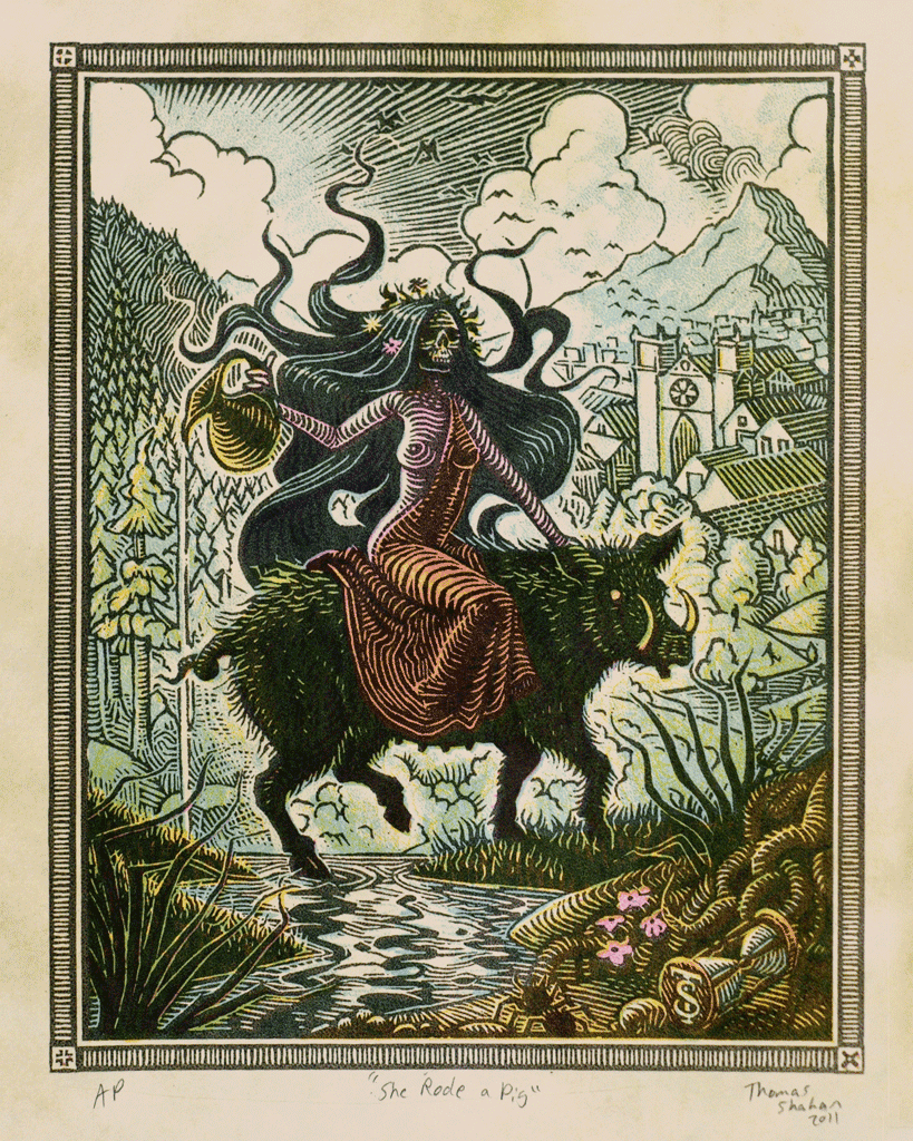 |
| This illustration reminds me of medieval art |
 |
| I reallay like this little spider print |
 |
| This is one of his printing blocks, it looks like wood |
Check out his sight
http://thomasshahan.com/#photos
People and Characters/ Artist research. Edward Bawden
My group and I decided that we wanted to use lino printing
in our group work. We decided to look at the work of Edward Bawden because his print
work looks amazing. I really like the textures he uses, and his colour pallet
works really well with the lino style. He manages to get quite a lot of detail
into his prints, I find this difficult and want to practice more. I don’t think
I will be doing a lot of the print work in our group project since somebody else is
doing that. I would still like to contribute though. Below are some examples of his work.
 |
| I like the use of colour on this cat and the texture in its fur |
 |
| A black and white lino cut by Edward Bawden |
 |
| Another black and white print of a market |
Subscribe to:
Posts (Atom)